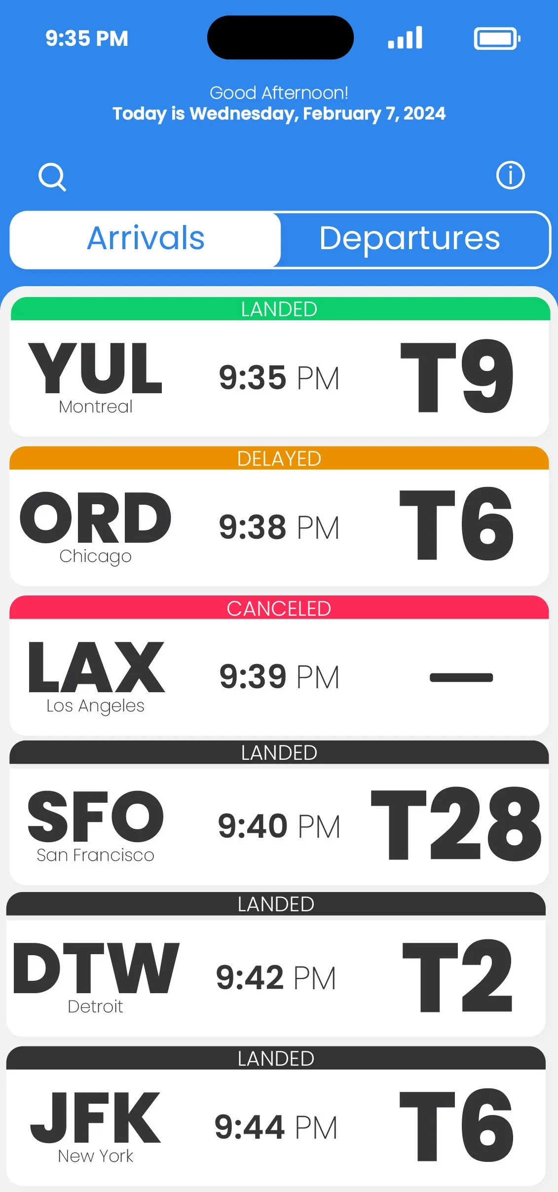
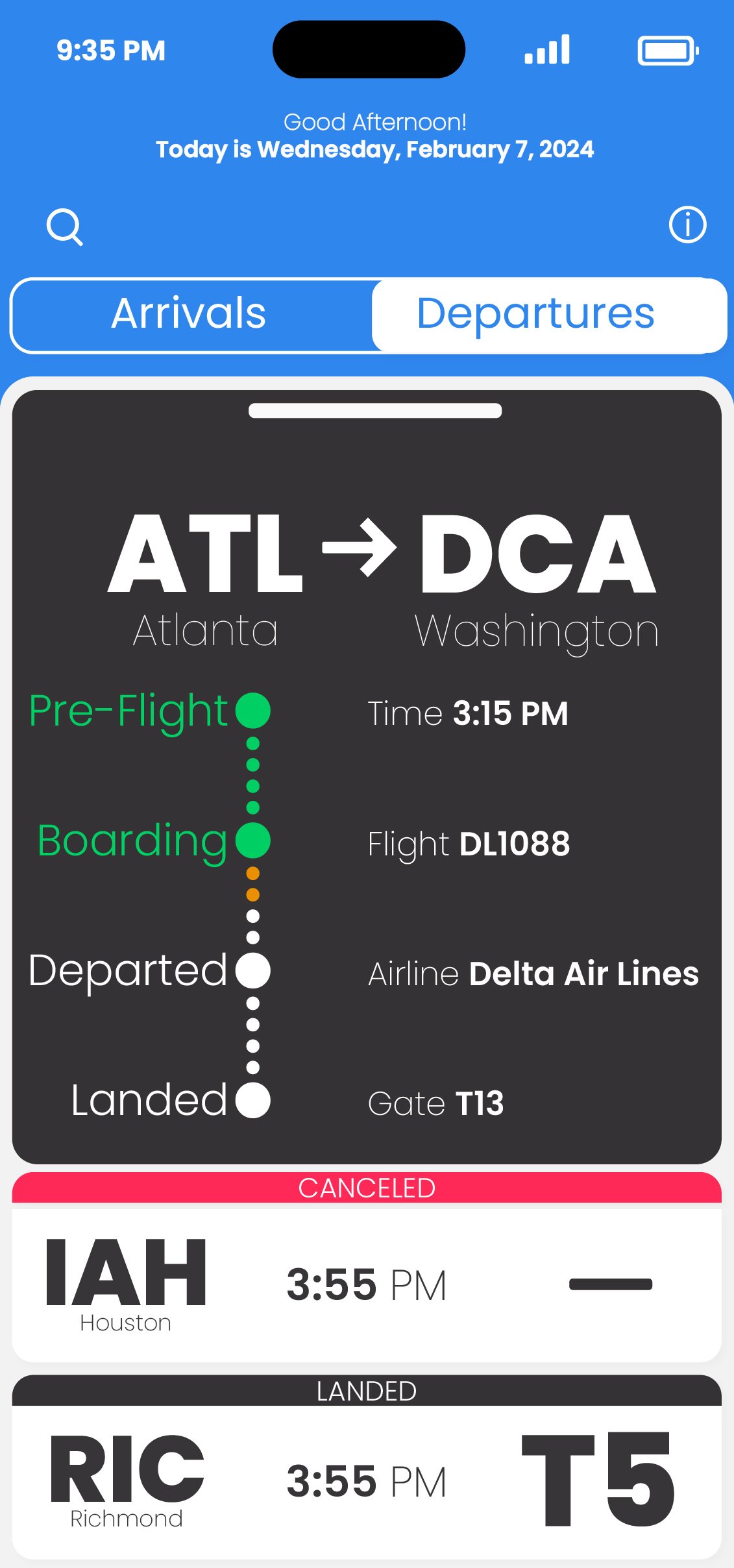
ATLANTA AIRPORT INTERFACE
Objective
This project focuses on designing a Flight Information Display System (FIDS) for Hartsfield-Jackson Atlanta International Airport. Made for the iPhone 14 Pro, the display provides real-time updates for departing and arriving flights. The goal was to build a clear and scalable structure that works across both large and small typographic formats.

Sketching & concepts
The first step was creating loose sketches to shape the app’s structure and overall flow. These early drawings helped guide the design direction and layout ideas.


establishing type hierarchy
Poppins, a geometric sans-serif typeface, was selected for the interface. It works well for headings and navigation text while also supporting multiple languages. Its consistent line weight gives the design a sharp and minimal look.
Interface Exploration
Different layouts and navigation paths were tested to see how typography and structure worked together in the app’s design.
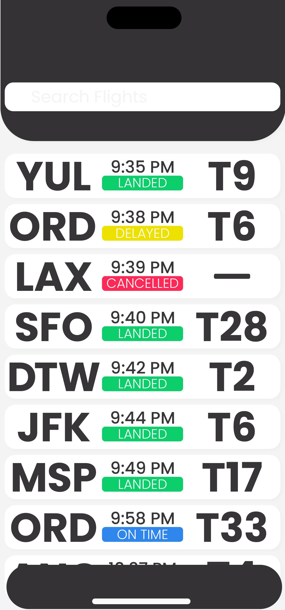


Color & Typography exploration
The interface uses emerald, carrot orange, and folly as core colors. Each one connects to familiar meanings: emerald (green) signals “go,” carrot orange suggests “wait,” and folly (red) marks “stop” or an issue. These colors are used consistently to show whether a flight is on time, delayed, or canceled.

Emerald
12 206 107

CARROT ORANGE
234 144 0

FOLLY
255 41 87

JET
53 50 52

WHITE
255 255 255

SEASALT
248 248 248
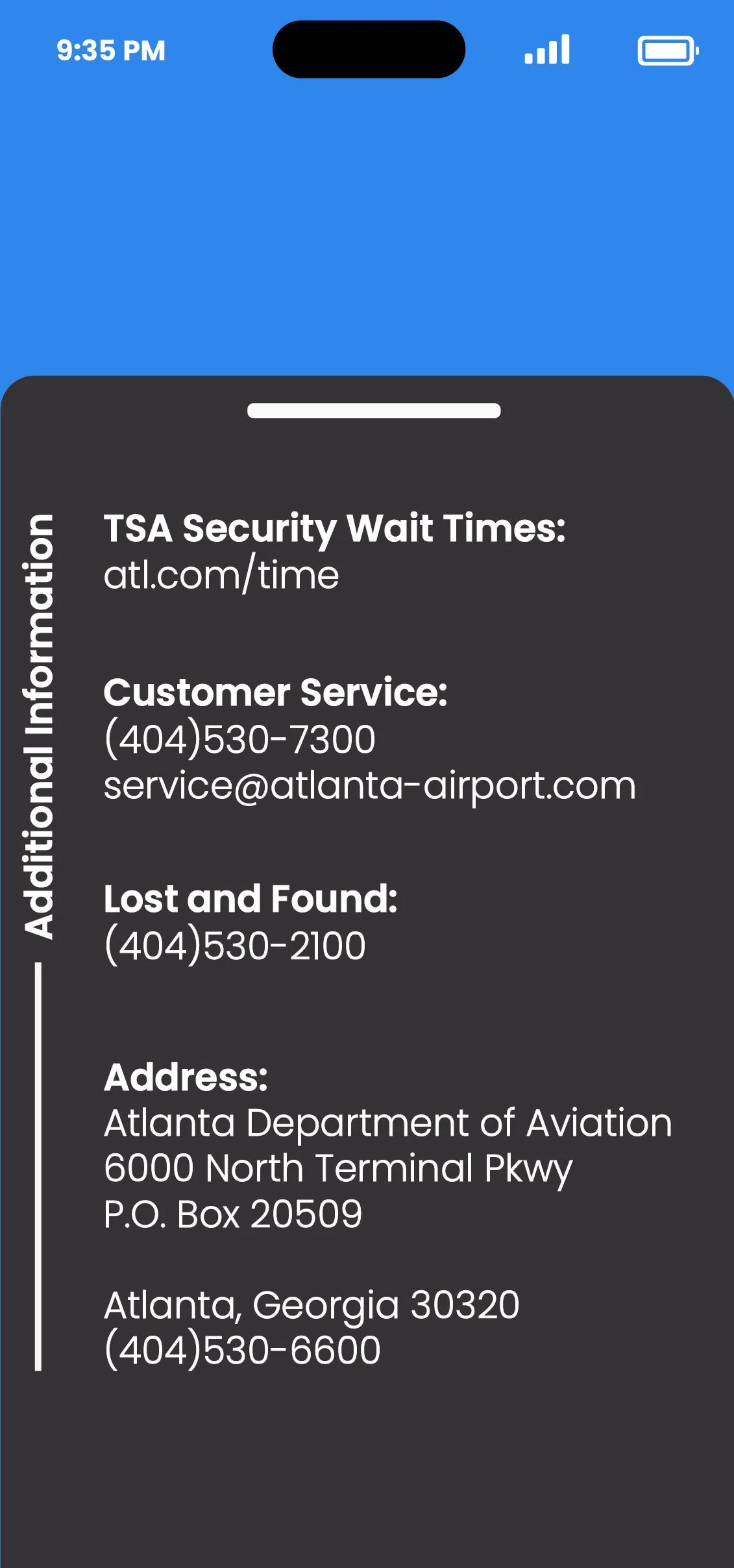
Final interface design
The final design brings typography, color, and navigation into a polished system. It’s a clear, cohesive interface built to guide users quickly and effectively.


