TREE FROG CREATURE MARK
Objective
The goal was to create a clean, geometric creature mark that could stand on its own and also be adapted into a larger brand. This direction led to developing the mark as a logo for a fictional beer company, showing how the design could work in a real-world context.

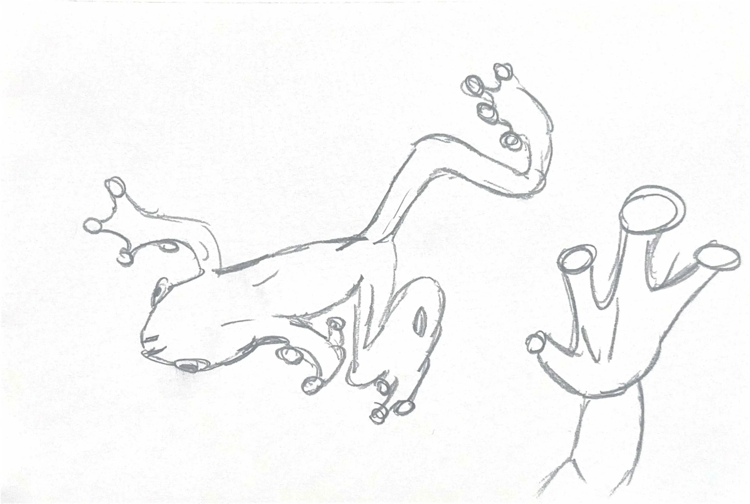
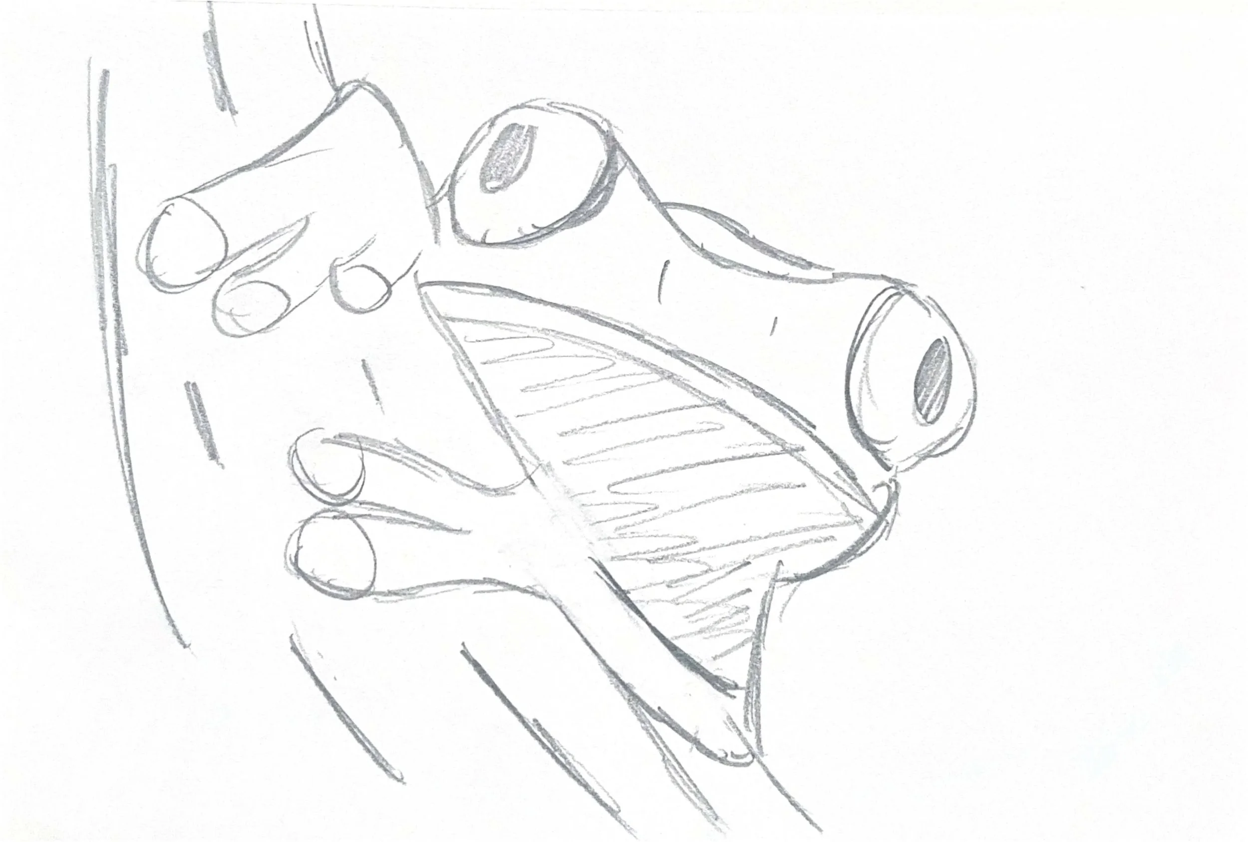
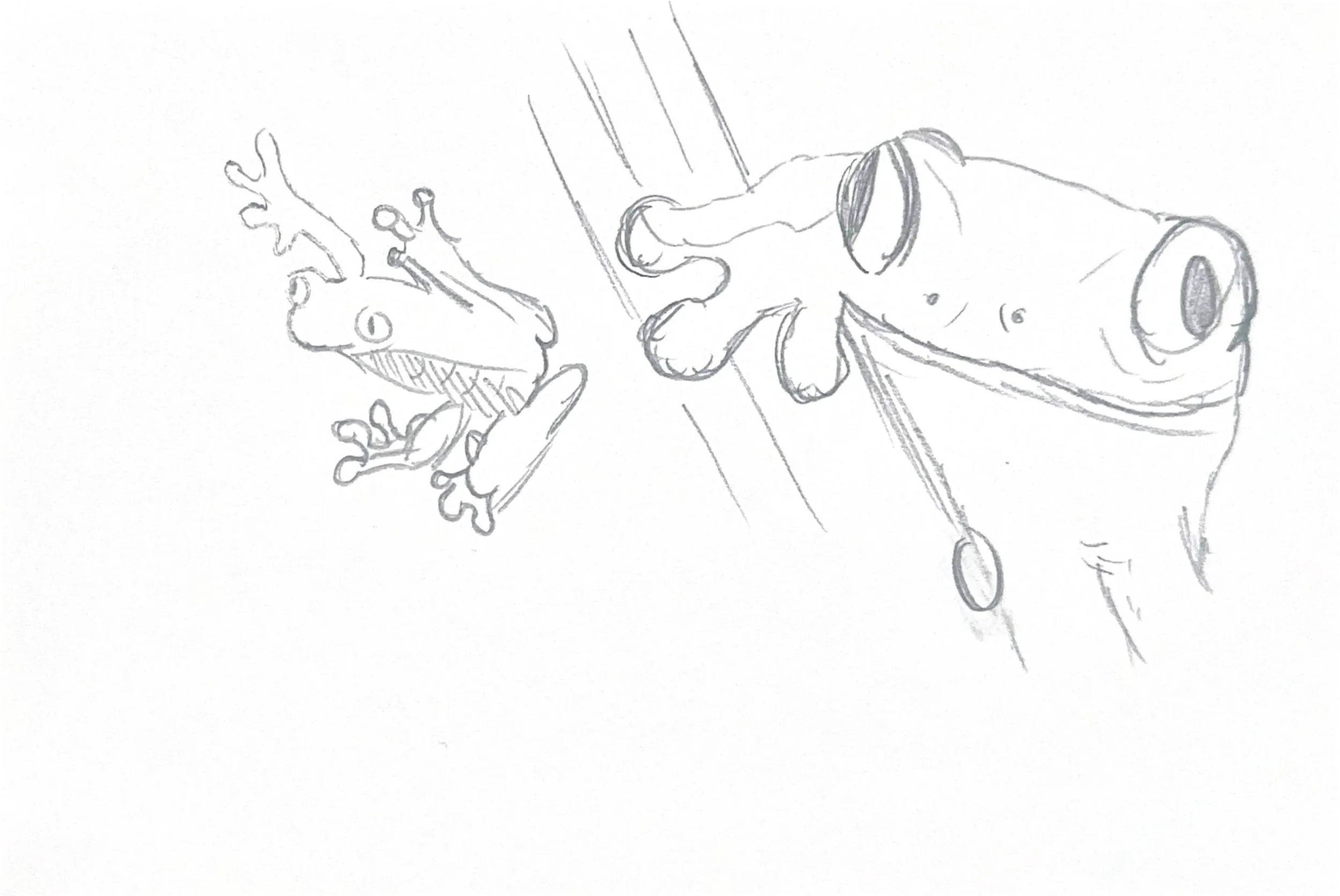
Sketching & concepts
The first step was creating sketches to learn the shape of my animal. These early drawings helped guide the design of my creature mark.
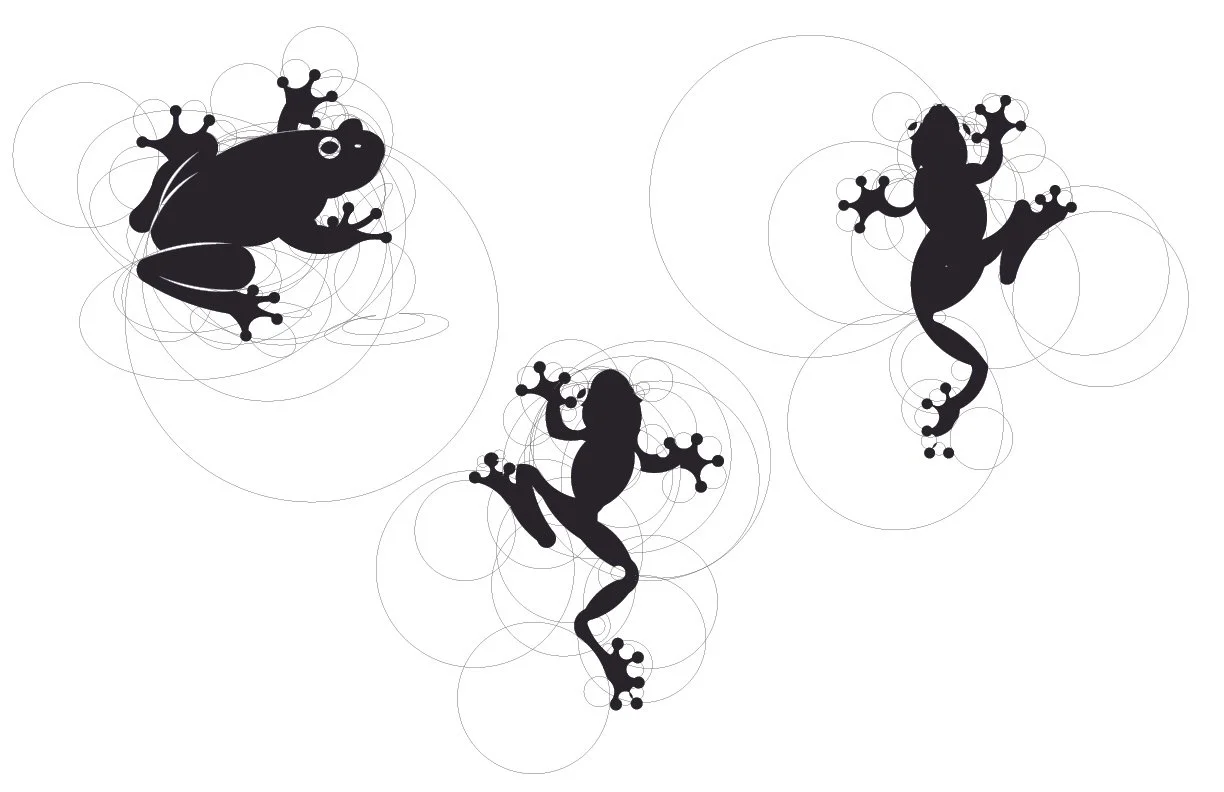
Digital Iterations
In the digital stage basic shapes were used to build out the creature. From there, the structure was refined through small adjustments and variations, focusing on developing a recognisable mark.
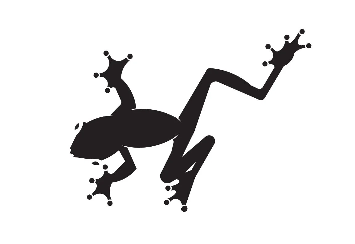
FINAL MARK
The final mark brings together the refinements made during the digital process. Built from overlapping spheres, the design creates a simple, overhead view that highlights the key attributes of the treefrog.

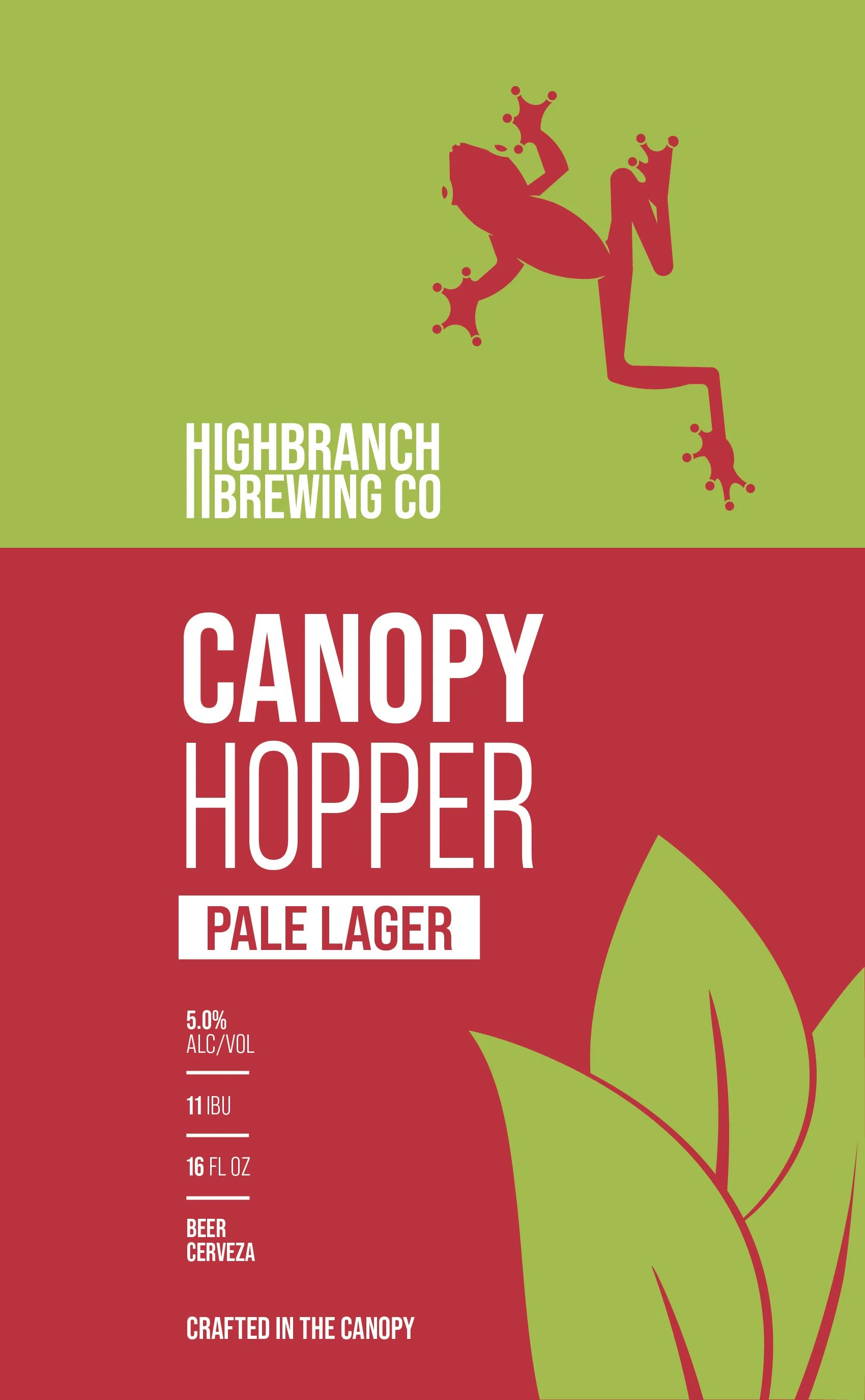
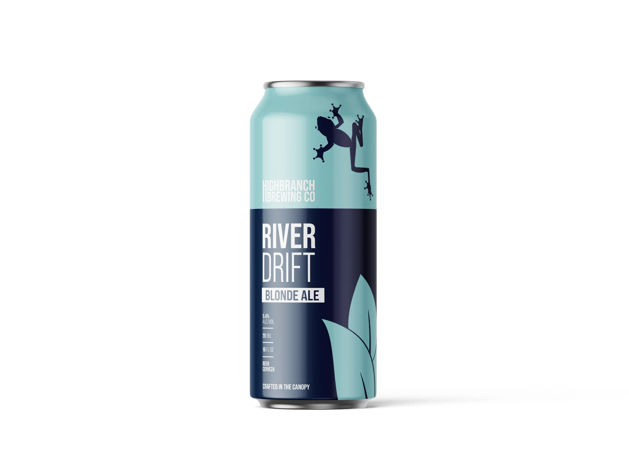
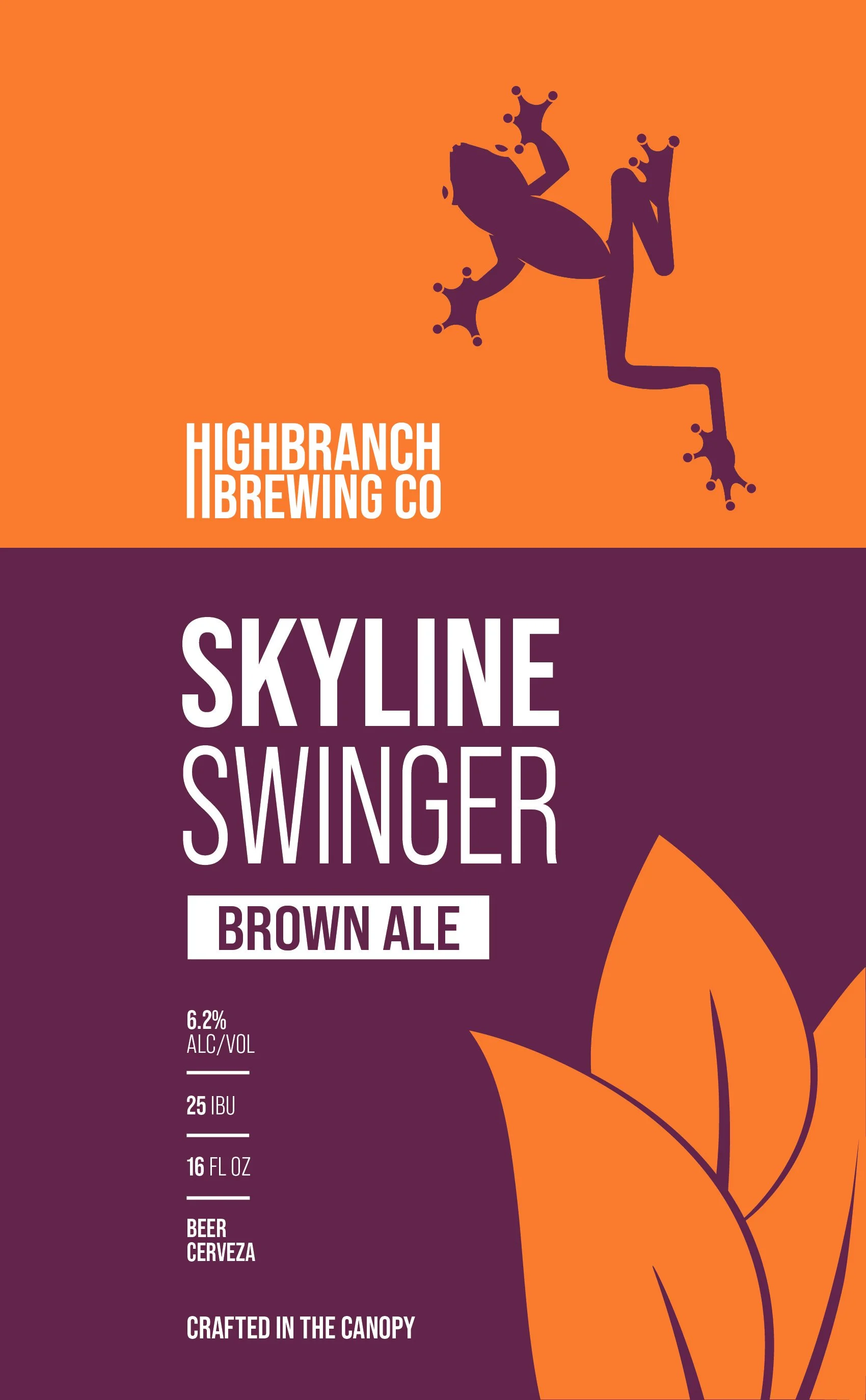
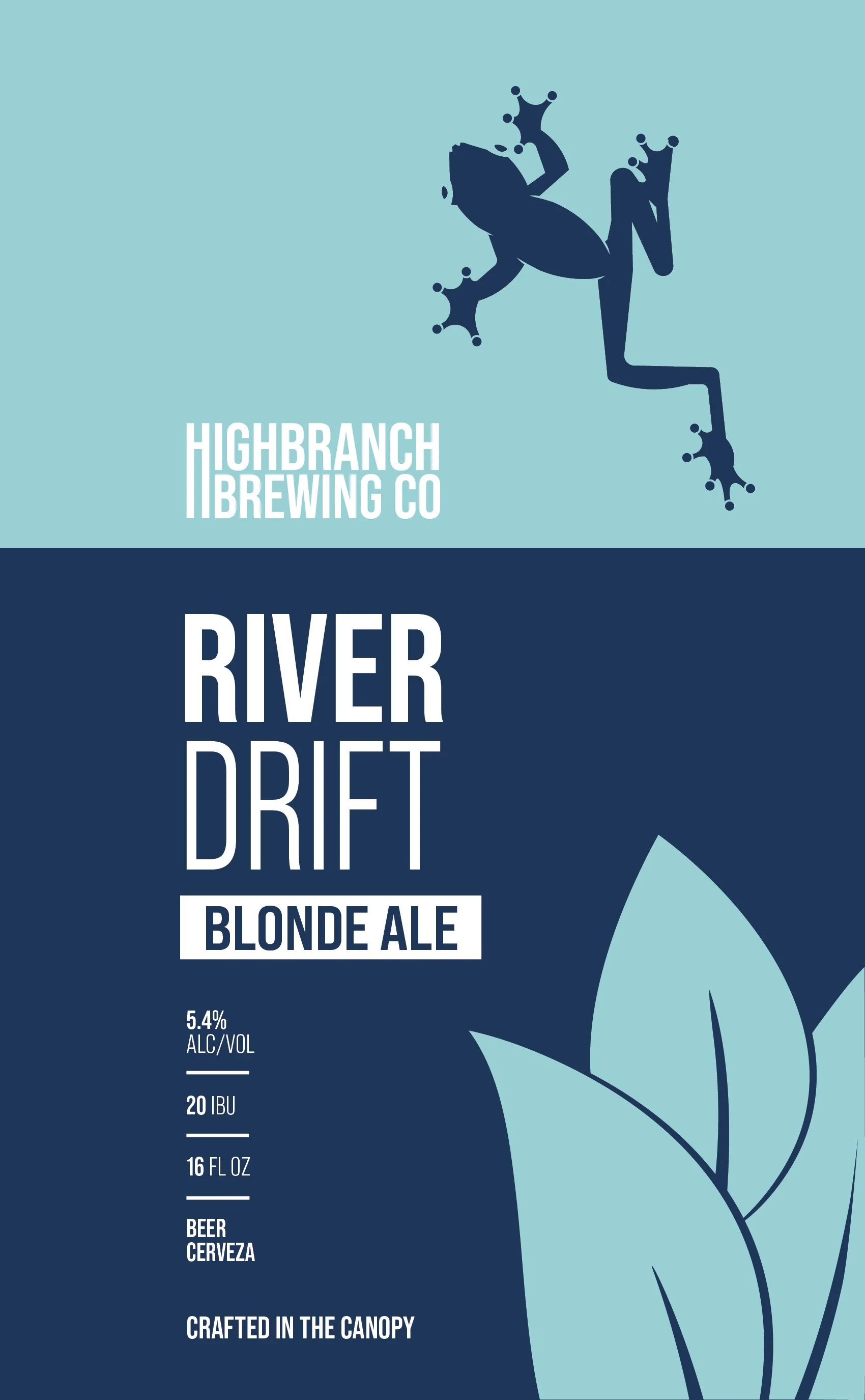
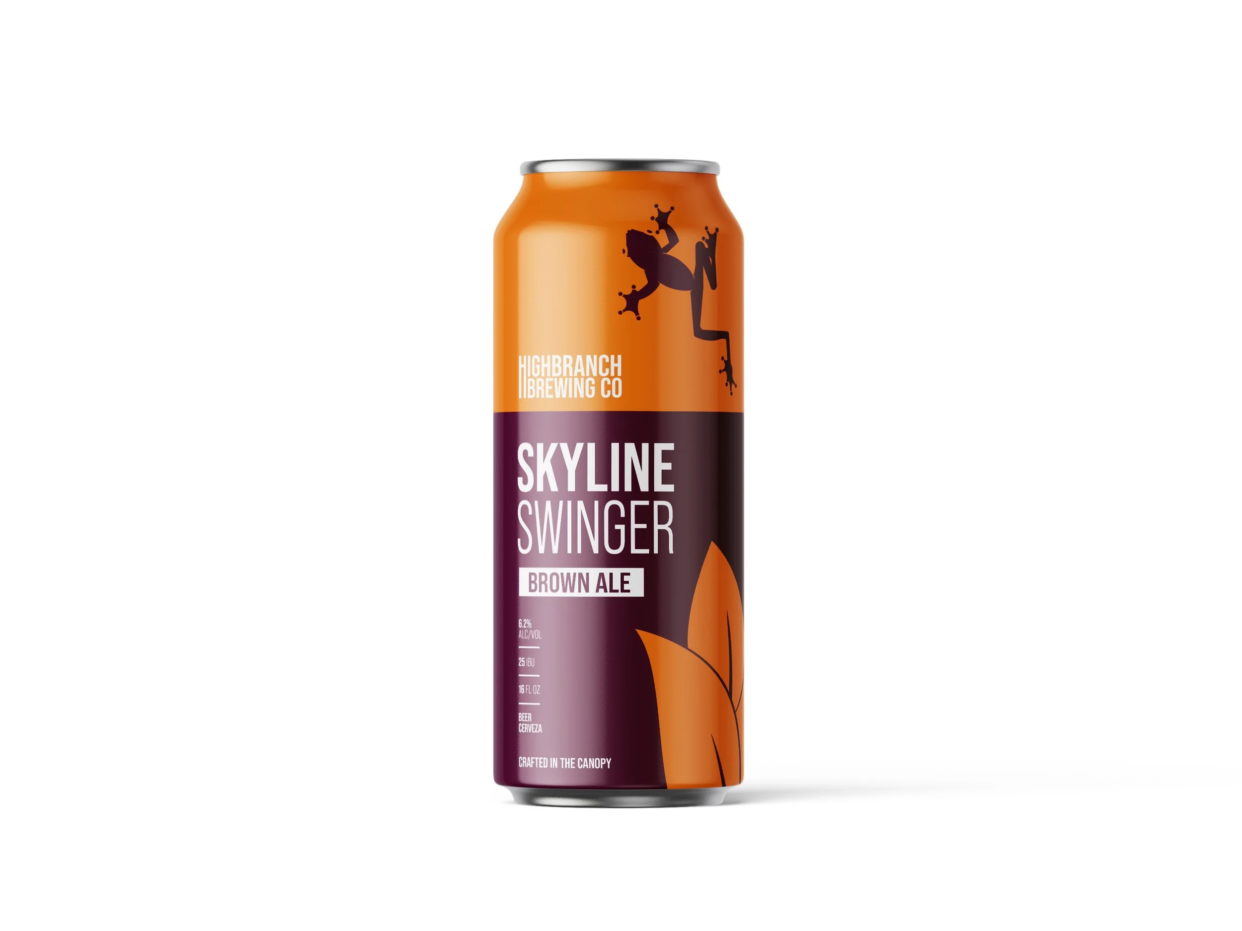
HIGHBRANCH BREWING CO.
To show how the creature mark could work in a branding setting, it was developed into a fictional beer company identity. The mark was applied to a simple beer can, creating a consistent look that highlights how a simple logo can adapt into a full brand system.
Visual
A bold color palette and simple logo create a clear identity. The logo and colors are meanr to easily be applied and utilized for the can design.

YEllow green
167 201 85

Cardinal
191 46 57

Non Photo blue
169 218 220

Berkeley Blue
28 53 87

Tangerine
246 139 41

TYrain Purple
95 15 64

APPLICATION
The mark was placed into mockups to show how it could work in real-world settings and work on a real can.
FINAL DESIGN
The final design brings together the logo and color system into a clean can design that can easily be adapted to showcase different drinks/color palettes.